Thursday, April 25, 2013

Little White Schoolhouse

This past semester we had the opportunity to work with the community of Valley, WA to propose design ideas for the adaptive reuse of their original schoolhouse to a local museum. We began the process with an all day workshop, meeting with about twenty community members to discuss the needs and desires of the space. While there were many opinions, this made for a great learning experience. Our design needed to please many people, rather than one or two clientele. For our design our focus was to phase out the project. There were so many great ideas that would be hard to implement immediately due to time or budget. The first phase addresses a quick installation and minimal budget. The second phase focuses more on ideas that can be installed individually as the budget allows. This phase also address the need for a community gathering space. Through our design we allow the opportunity for the Little White Schoolhouse to expand and grow as the community needs change.


Tuesday, February 19, 2013

Webster Geology Museum

This collaborative project was a very new experience for me. Working with 8 other designers was both a challenge and a great learning experience. Through this I learned some very valuable skills. Collaborating with other designers is part of the everyday design world so learning how to work with 9 different design perspectives was a very positive experience. I learned how to communicate my ideas as well as how to listen and understand other's ideas as well. Because of our success collaborating, my partners and I designed a very strong space using the resources the School of Environment and Department of Physics already had available. 

Through the process there were multiple challenges including unknown specifics as to regulations and wants and needs of the School. Our group adapted well to these changes. While designing we used trial and error to find the best methods to design. At various points in the process the entire group worked together, worked individually, and worked in smaller groups to complete the project. We found that breaking into smaller groups of 1-3 people, then meeting as a whole group as the work was completed helped get the work done more efficiently. The extensive use of communication helped make sure everyone's voices and opinions were heard. 

I found throughout the project that my communication skills were a strength of mine that I was able to develop even more, however my leadership skills were both a strength and weakness. While I am a strong leader, there were times I struggled to step down and let others take the lead. Through the course of the project however, this became easier to do. Our group meetings were especially helpful for learning when to take a leadership role and when to let other's step up in the position.

The poster below is one of 7 case layouts our group designed. It is a great example of our collaborative design. We each individually researched a topic to be displayed in the case, my topic being the geology of the Palouse. Once the research was completed we each individually made posters for our topic. As a group we chose characteristics we all liked to further develop. I partnered with another group member to create a template outline for each member to input their individual research into. After this stage another group member created a cohesive design for all 7 posters. The process really shows how our grouped worked together to create a collaborative design. 


Wednesday, April 18, 2012

Depot Project Concept Model


For every project we begin with a concept. The concept for my Depot Project began with the armrest of a bench found in the depot (a picture can be found in the Textile Design post.) I pulled three words from this object, contrast, movement, and rustic that became the driving force for my concept development. The parti is my 2D representation of all three words combined together. I then moved onto my 3D model. Contrast can be seen between the straight dowels and curved portion, the wood and metal, as well as the black and white circles. Movement is evident through the dowels that move right through the curved metal, and in the overall curved shape. My interpretation of rustic is the idea of imperfection. I implemented this in the varying dowel lengths and the circles that are randomly put together, interlocking in various ways.

Textile Design


These pictures illustrate the process I went through to design my own textile for the Depot project we are currently working on. The first image is my inspiration object, the armrest of one of the original benches found in the Depot. From this picture I pulled three elements of design to continue my exploration: Contrast, Movement, and Rustic. With these three words I drew partis, small sketches, that I felt represented the combination of the words. My top eight are pictured. The next step was to choose my favorite two that I would turn into patterns. I rotated, flipped, mirrored, etc, to my parti modules to create different patterns. Two patterns for each module are shown. Once I created these patterns, I played around with various color schemes that I felt helped add to my concept with the three words. I focused mainly on complimentary colors to help add to the contrast. Once I chose my favorite pattern and color combination I created a 36"x36" pattern to represent what a yard of fabric, with that design, would look like. Using Spoonflower.com I uploaded my module, only to find my pattern was more complex then the few rotating options they had to offer. To fix this issue I simply uploaded the entire 36"x36" pattern onto Spoonflower's site and centered the pattern on the yard of fabric. After seeing how the fabric moved with the textile printed on it, I may have liked the pattern to have been smaller, but overall I'm very pleased with the final outcome, that is shown in the last image. I'm planning on incorporating the module in my Depot project by designing a coffee table that uses two modules side by side to create the legs.

Monday, March 26, 2012

Client Brief

For our adaptive reuse project, I have selected the artist Todd Horton to design a residence, studio, and gallery space. Todd is a painter who currently resides in Edison, WA. He grew up in an artistic family and spent many years traveling to countries like Japan, Germany, and parts of North Africa (along with many more) painting and teaching. The oil on canvas medium allows Todd to apply a quite distinctive effect that looks either "squeegeed" or "dripped." This gives the paintings a sense of movement. The two subjects he typically does are landscapes of the Pacific Northwest, and animals.
Because he resides in my hometown, I have visited Todd's studio, and one of the galleries he shows his work. Being able to walk through his studio and see how he works really helped me understand his process. It will allow me to better meet his needs in this project. Knowing how his work is currently displayed helps me understand one way to focus on his paintings, but also inspires me to find new and creative ways. I'm excited to work alongside him to create a space that will inspire him.
 Dark Sky Blurred
36"x36" 
Oil on Canvas
 Eagles that Drift Like Dreams
36"x36"
Oil on Canvas
 Field of Dew
30"x30"
Oil on Canvas
 Running Water
20"x20"
Oil on Canvas

You can find more of Todd's work at www.toddjhorton.com as well as a full biography.

Tuesday, March 20, 2012

Habitat for Humanity

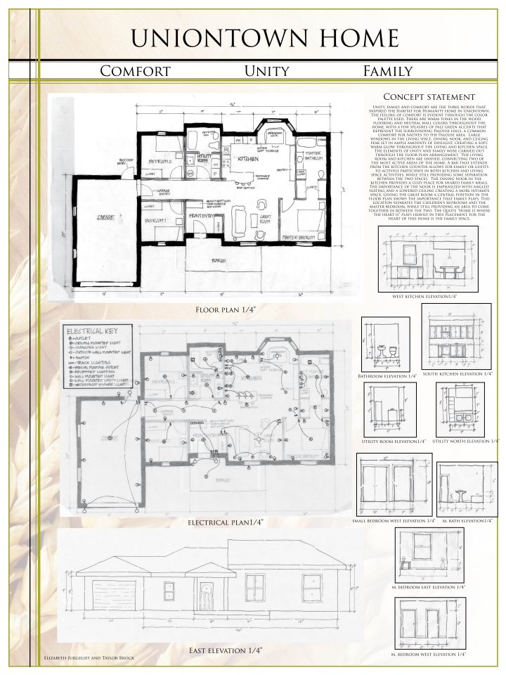
The first project of our Spring semester was one I took a personal liking to. We were given the opportunity to work with Habitat for Humanity here in the Palouse to design their next home. Although there wasn't a specific family chosen yet, we were given guidelines to help design the home. We were to design a 3 bedroom, 2 bath home in 1100 square feet. An open floor plan with a combined kitchen and living space was preferred. Budget was a large focus due to the need to keep the cost of the home low. We were also to keep mind sustainability and aging in place.

With all this in mind, my partner Liz and I worked to create a space any family could truly enjoy. We worked hard on finding a floor plan that was different from the floor plan of the previous year's Habitat House, to add to the specialness of the home the family would receive. To do this we placed the kitchen/living space in the center of the floor plan. The master bedroom is located on one side of this space, and the children's bedrooms and laundry room are on the other. This allows for a separation between the parent's and children's spaces while creating a combined living space in between. This floor plan arrangement is driven by the quote "Home is where the heart is." The heart of our home design is the family area.

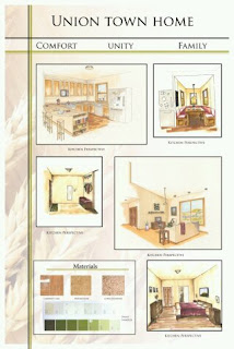
Because there was not a family chosen by the time we did the project we decided to base our material choice on costs and sustainability. We chose to use a cork flooring, which we found for $2.98 a square foot, in the kitchen to help with sustainability. The entryway, utility room, and bathrooms use a marmoleum flooring that was around $3 a square foot. This material is more sustainable than vinyl, and is more durable than linoleum. The rest of the home uses a laminate wood flooring to help lower costs. The kitchen counter uses granite tiles which were $5.93 a square foot. The tiles still give the luxurious look of granite, while providing a much lower price. Although the price is higher than laminate counter top, the use of granite will increase the resale value of the home. The home is painted using a neutral color, but we chose to use an earthy green accent to pull in the comforting green tones of the Palouse.

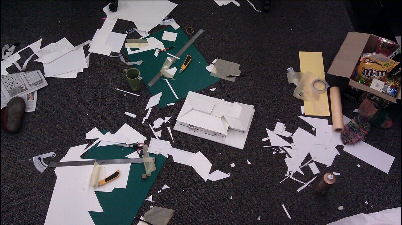
We had to design the roof for the home and build it on our model, which helped show how much the floor plan can affect the roof. After way too many hours and a floor full of scraps I finally got our roof line to work, and I couldn't be more proud. Our wish to include vaulted ceilings with clerestory windows in the living space proved much harder than I expected but added the roof interest the Habitat committee was looking for.

Overall, this project was a great learning experience for me. Being able to communicate with actual clients provided an experience I never expected to have at this stage in my schooling. I was much more attentive to detail, and even more concerned about the decisions I made. Having worked on the previous habitat home allowed me to bring actual experience into the project.

Sunday, March 4, 2012

Context Poster

To get started on our next project for our Studio, the class was split into different groups and assigned a topic relating to either early 1900 design, or design for an art studio. My topic was prominent US architects of the 1930s, and I chose to research William Gray Purcell. I had no idea who he was, but his named kept popping up when I was searching. I learned a lot about Prairie Style design, a very common design type of the early 1900s. It was developed by Louis Sullivan, who taught Purcell, and was carried out by many architects including Frank Lloyd Wright, and Purcell himself. This style is reflected in the depot we are rehabilitating, so learning its origins and other ways it was applied was very helpful.