Wednesday, April 18, 2012
Depot Project Concept Model
Textile Design
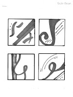
These pictures illustrate the process I went through to design my own textile for the Depot project we are currently working on. The first image is my inspiration object, the armrest of one of the original benches found in the Depot. From this picture I pulled three elements of design to continue my exploration: Contrast, Movement, and Rustic. With these three words I drew partis, small sketches, that I felt represented the combination of the words. My top eight are pictured. The next step was to choose my favorite two that I would turn into patterns. I rotated, flipped, mirrored, etc, to my parti modules to create different patterns. Two patterns for each module are shown. Once I created these patterns, I played around with various color schemes that I felt helped add to my concept with the three words. I focused mainly on complimentary colors to help add to the contrast. Once I chose my favorite pattern and color combination I created a 36"x36" pattern to represent what a yard of fabric, with that design, would look like. Using Spoonflower.com I uploaded my module, only to find my pattern was more complex then the few rotating options they had to offer. To fix this issue I simply uploaded the entire 36"x36" pattern onto Spoonflower's site and centered the pattern on the yard of fabric. After seeing how the fabric moved with the textile printed on it, I may have liked the pattern to have been smaller, but overall I'm very pleased with the final outcome, that is shown in the last image. I'm planning on incorporating the module in my Depot project by designing a coffee table that uses two modules side by side to create the legs.
Subscribe to:
Comments (Atom)


